Why An Ugly Website Is More Than An Eyesore
 It may be difficult to quantify or explain an ugly website, but chances are that you certainly have no difficulty recognizing one. This can happen for a number of reasons, but it’s important to understand that when you have an ugly website, it’s more than something that’s just unpleasant to look at. In some cases, some of these design decisions may be affecting the message and content of your website in other ways that you may not realize. Here are some common examples.
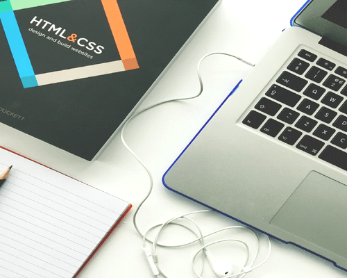
For one thing, you need to understand that there’s a fine line between clutter and flair when it comes to a website. Many novices make the mistake of trying to stand out by adding a variety of different fonts, textures, or other similar visual aspects that they think will be more appealing. In reality, though, it may make things more confusing. Your basic visual design should have no more than three fonts, and generally keep to a simple linked color scheme. Consistency is something people value across any service or business, and your site should reflect that.
Let’s also take a moment to talk about using images on your website. Naturally, this can catch the eye of people, as well as improve your SEO if you take the time to include tags. However, there are ways that things can go wrong. For example, make sure that you look at the size of an image before you upload it. You may not notice it from the back end, but excessively large image files mean the user takes much longer to load the final page. Another thing worth noting is the fact that it pays to be a bit discerning when it comes to stock images. If you spend a lot of time working with them, you may see a few pictures starting to look familiar around certain websites. There’s nothing wrong with stock photos, but an overly-used one leaves a bad impression for many.
Finally, there’s the matter of disorganization. No one likes a website where it looks like the links for pages are all over the place, but what you may not realize is how this is impacting your clicks. Generally, you want to make sure your navigation isn’t too different from other sites in your niche. Think of it like road signs. They look the same because they want to be universally understood, and a lot of this applies to web design as well.
As a result, when you’re looking to change your website, or working on creating a new one for your business or service, it’s important to understand that the visual aspect isn’t something that you want to push to a later stage or if you have a surplus. Bringing on a skilled web design service should be a core thing that you’re looking to do as a part of your marketing strategy. Not only can they help fix issues that may be going on with the appearance of your site, but they can help you work on potential problems behind the scenes as well.